2025
Launch education travel without overbuilding
Worldschooling is an education-travel business helping families compare and book international learning programmes. I worked on the product structure, homepage journey, programme comparison, eligibility flow, deposit logic, and visual system.
The goal was to help parents judge fit, understand the next step, and place a deposit without waiting for a full custom booking system.
Problem statement
Because the first version was scoped like a full booking platform, the team risked delaying launch before parents had a simple way to compare programmes, judge fit, and understand the deposit step.
1 — Reduce the platform vision into a first release
The planned platform had enough pieces to become a long build: campus pages, subject pages, programme pages, search, blog, booking portal, and payment. That scope would have delayed the sales and fundraising surface the team needed first.
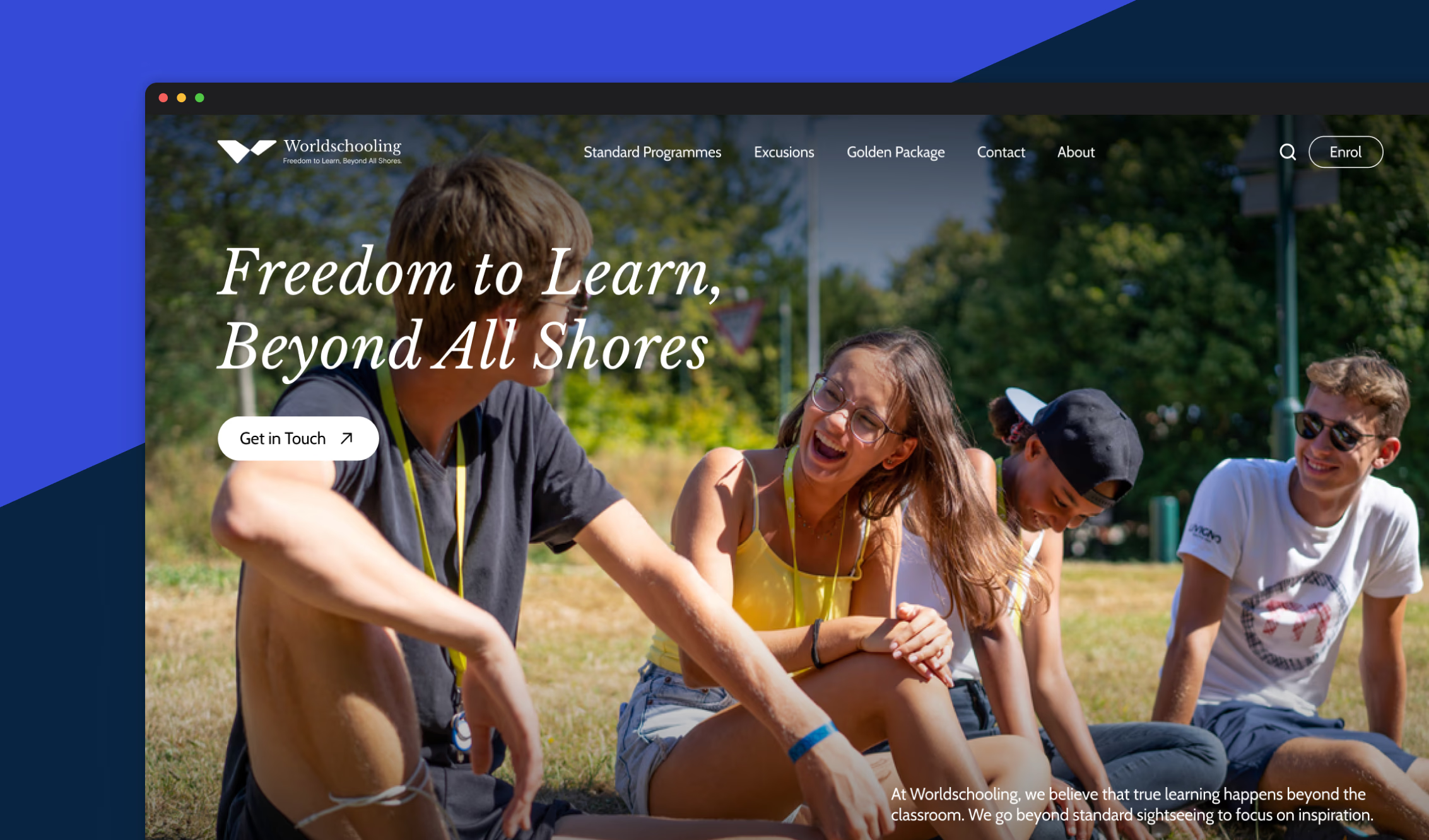
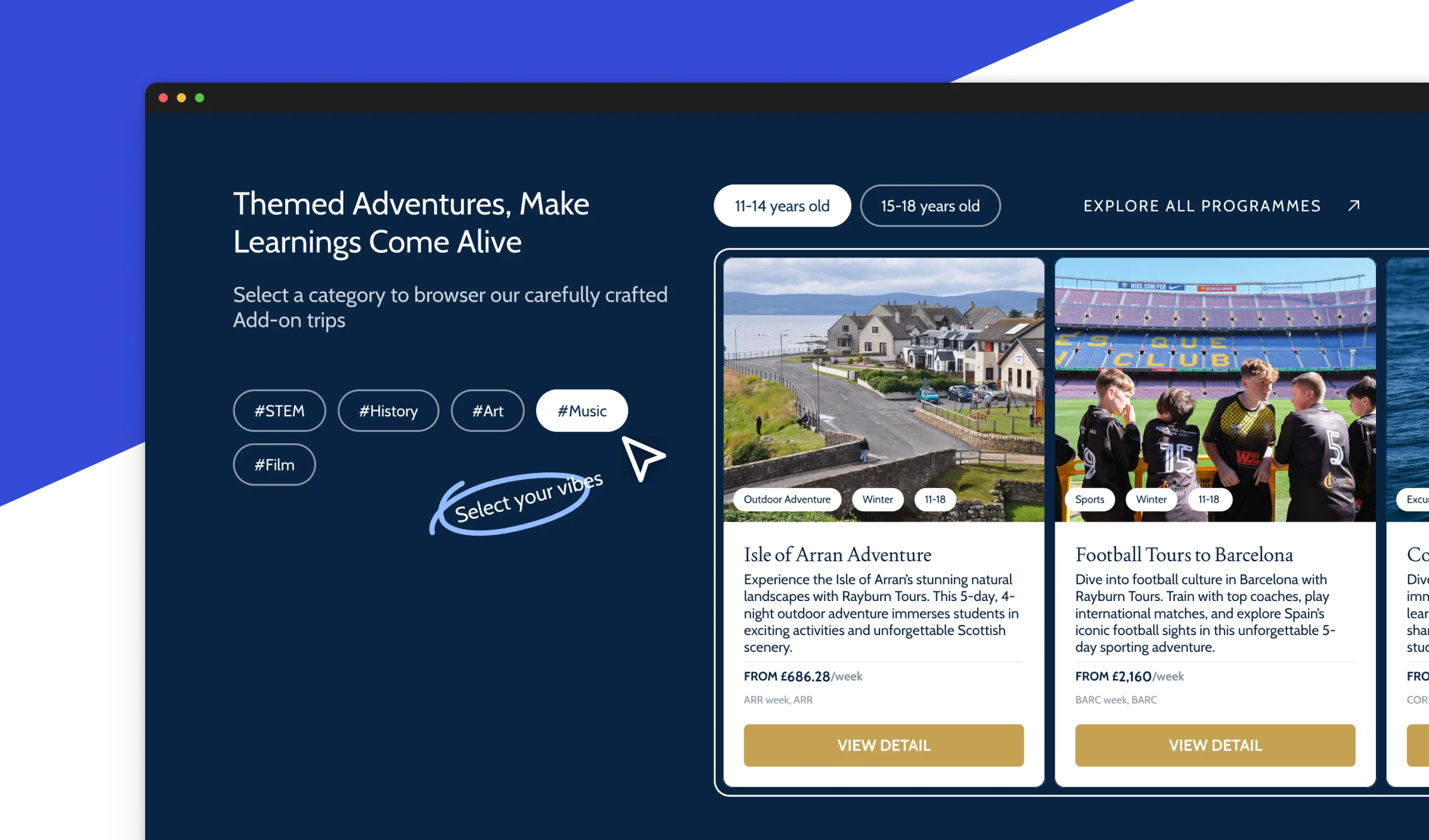
I reframed the first release around five visible steps: discover programmes, compare options, read details, submit eligibility information, and pay a deposit.
The tradeoff was deliberate: less automation at launch, but a credible product surface the team could use sooner.
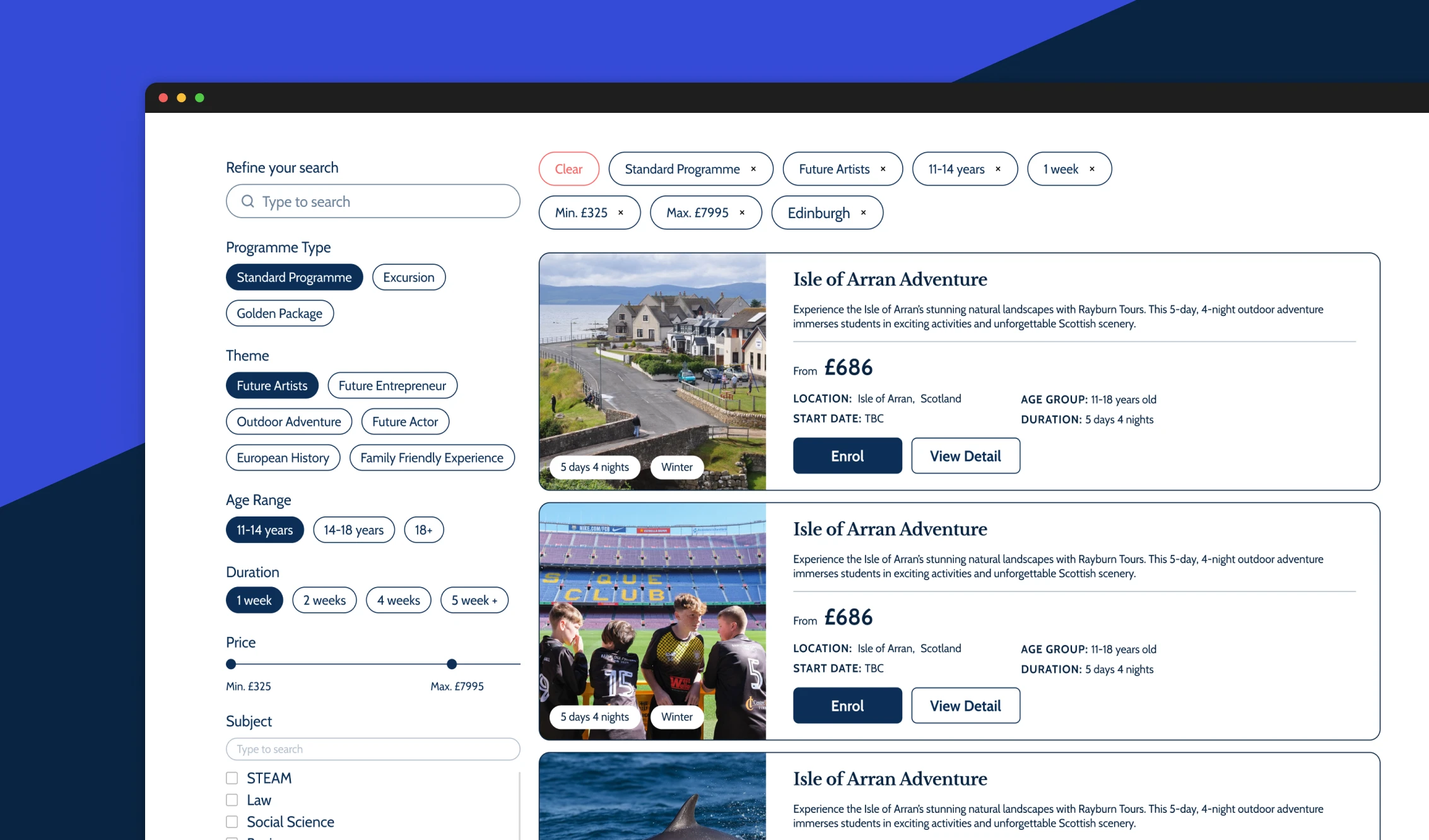
2 — Help parents compare fit before commitment
Parents do not begin by asking whether the site has a custom booking engine. They ask what the programme is, whether it fits their child, what is included, how safe it feels, and what happens after they submit details.
I exposed programme categories earlier in the journey and used filtering, cards, and detail pages to make comparison part of the first-screen logic.
Better comparison supports higher-quality enquiries and helps the team explain mid-tier and premium programmes without relying only on calls.
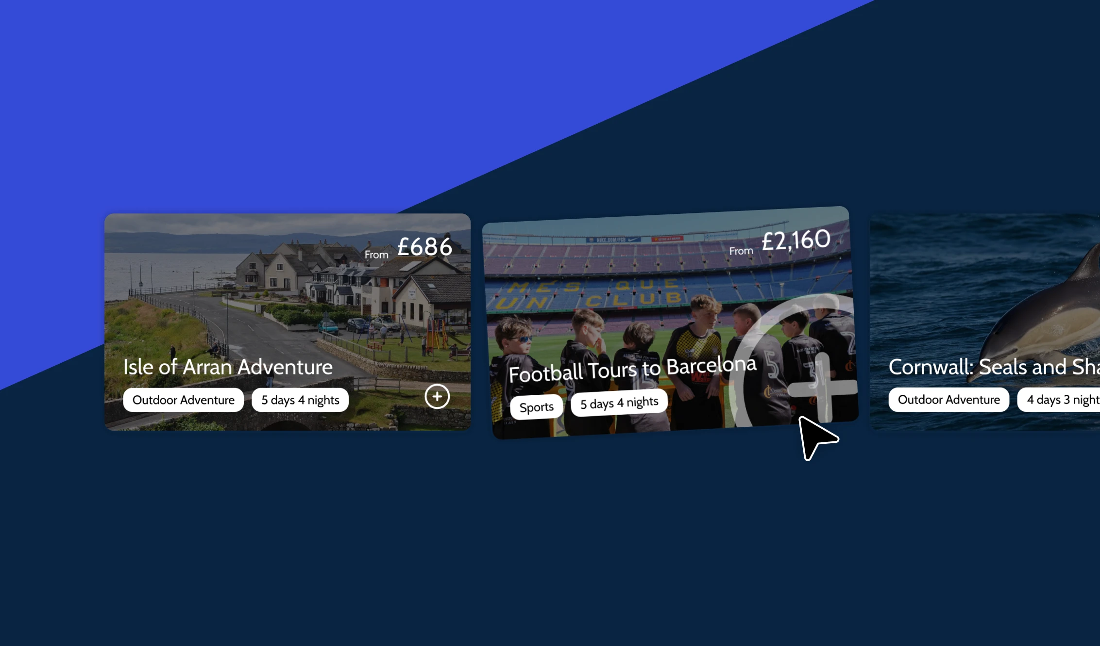
3 — Use recommendations to support value ladders
Entry-level pages were a natural place to introduce higher-value options, because users were already comparing dates, themes, and outcomes.
I added recommendation cards to show the next tier without forcing users into a hard upsell. The page could guide exploration while keeping the original programme path intact.
This helped the team connect lower-intent browsing with higher-value programme discovery at the moment comparison already made sense.
4 — Connect the website to the real student experience
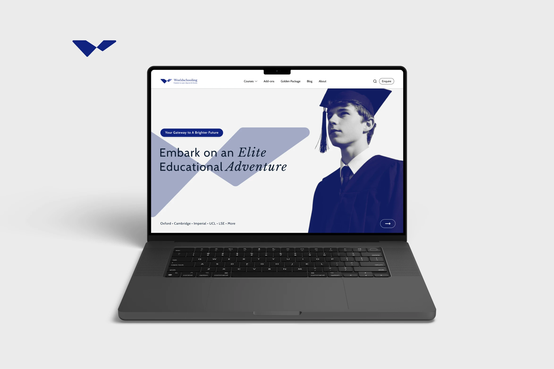
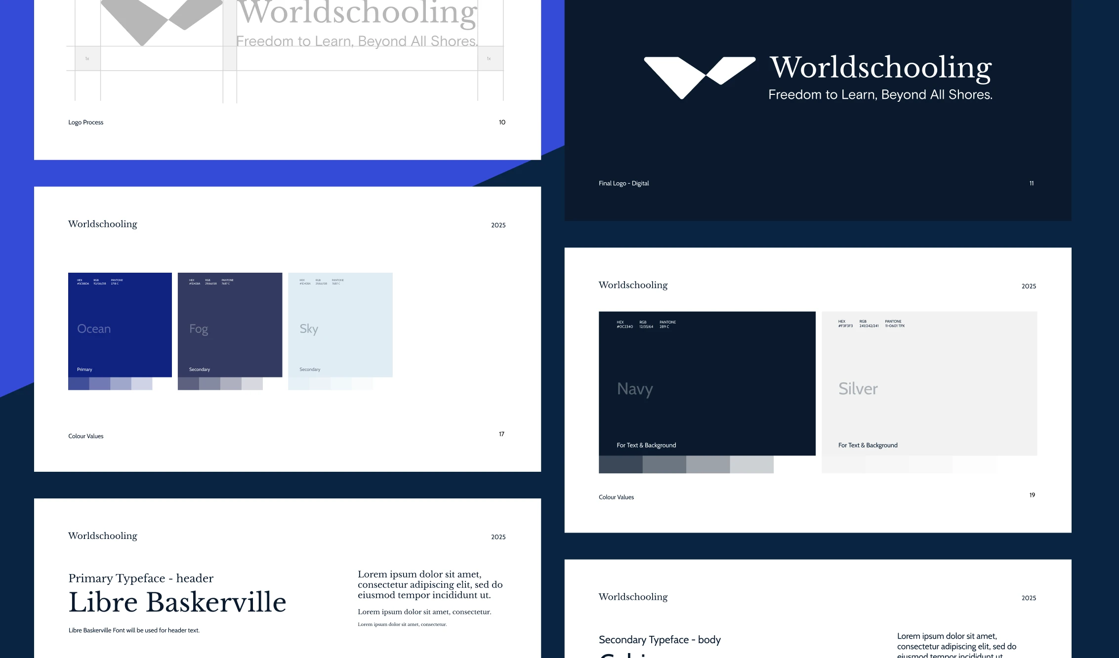
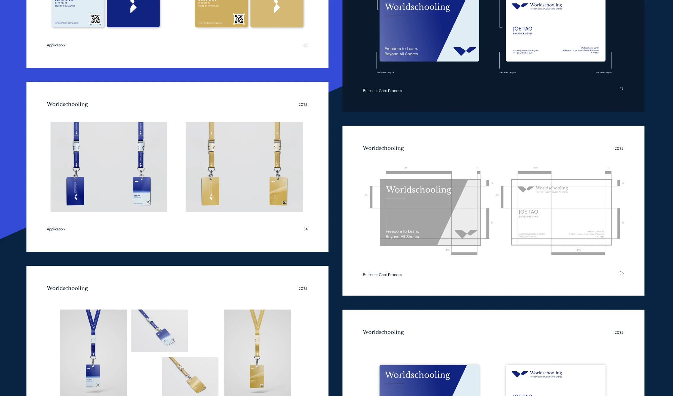
The brand system needed to support more than the website. It had to carry through student-facing materials, campaign assets, and future programme pages.
I created reusable visual rules for typography, colour, programme cards, and physical touchpoints so the website felt connected to the real education-travel experience.
That gave the team a more coherent system for sales, operations, and future content production.
Delivery and results
The first release became a focused journey: homepage, programme filtering, detail pages, eligibility form, and universal deposit link.
It was less automated than a custom booking portal, but it launched faster and kept the important parent decisions visible: fit, commitment, eligibility, and deposit confidence.
So what?
The project showed that early platforms often need sharper scope more than more features. Parents did not need a fully automated booking engine first; they needed confidence that the programme fit their child and a clear next step they could trust.