2025
Turn skincare browsing into confident checkout
Depology is a Korean skincare DTC brand selling science-led products to international customers. I worked on the mobile commerce experience across navigation, product pages, buybox, cart, checkout, and reusable UI patterns.
The goal was to help high-intent paid-social visitors understand products faster, choose the right offer, and complete checkout with less hesitation.
Problem statement
Because the mobile journey did not give users enough control or clarity at key decision points, shoppers hesitated across navigation, offer selection, cart, and checkout, which weakened conversion from paid traffic.
1 — Make product discovery easier to delegate to the interface
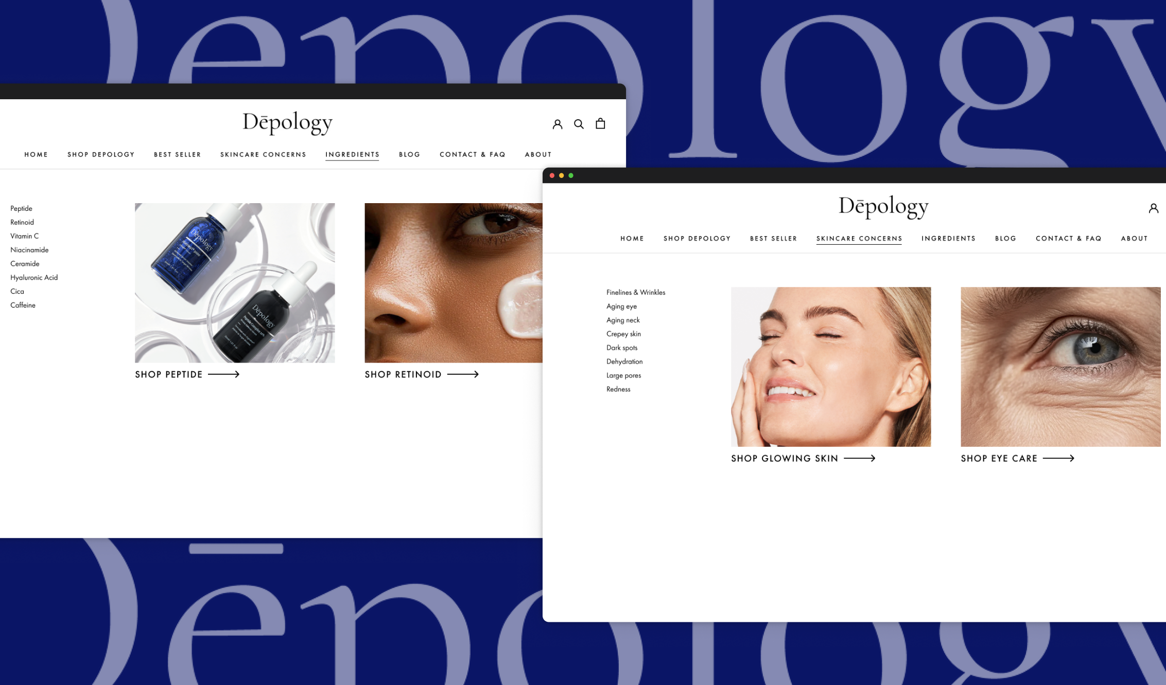
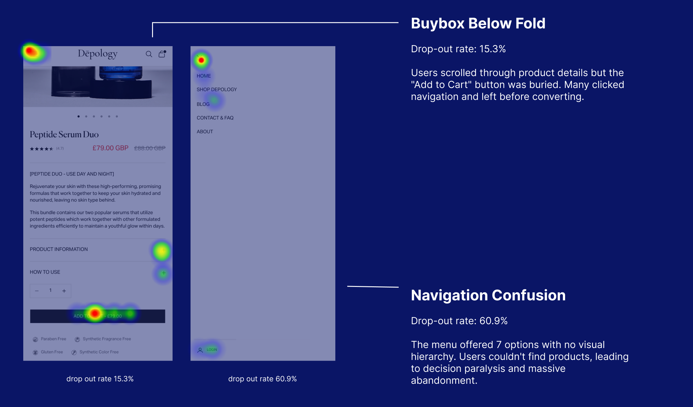
Users arrived with different intents: some knew the product type, some knew their skin concern, some wanted bestsellers, and some were comparing offers. The old navigation exposed options, but it did not help users decide where to go next.
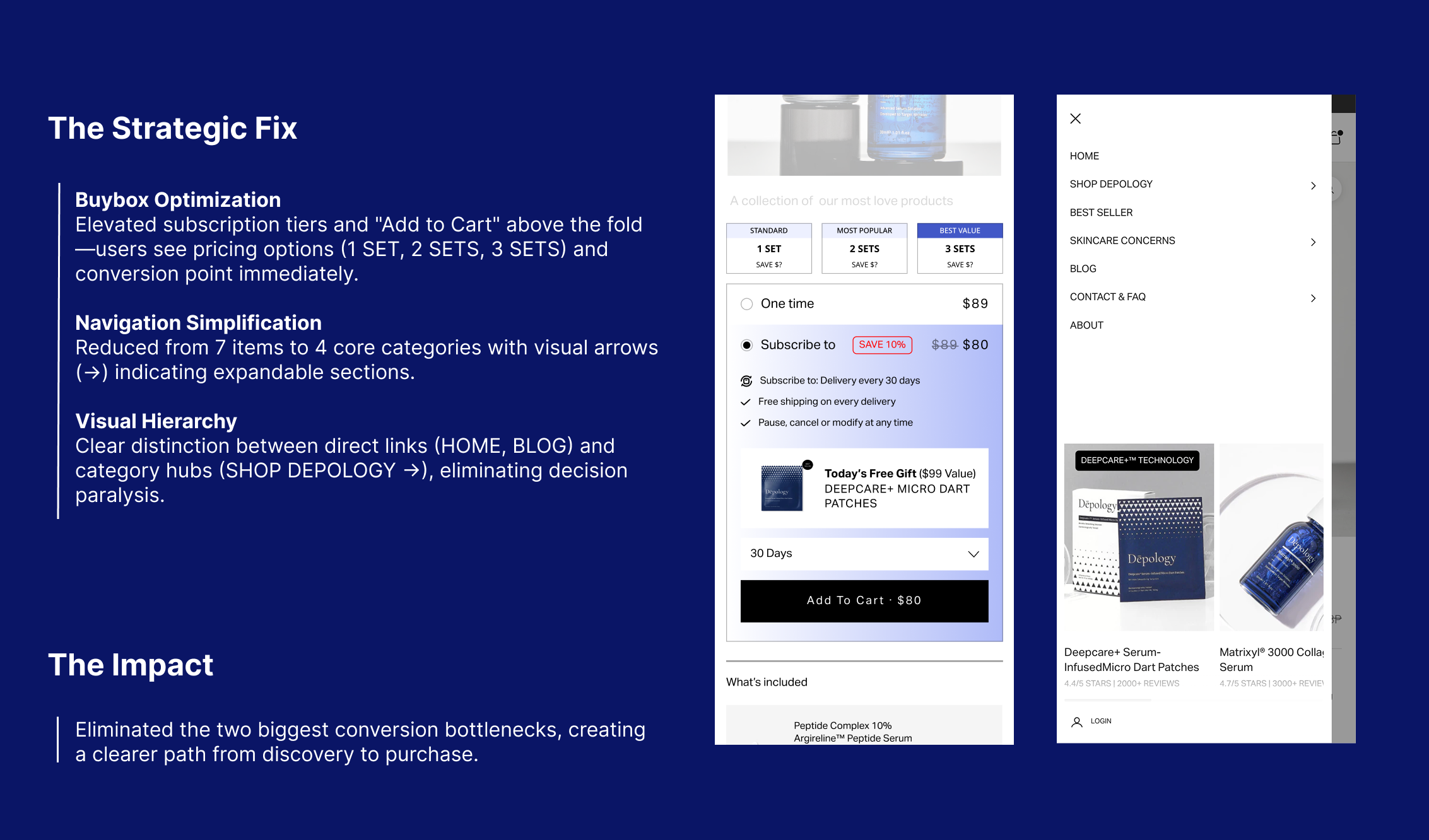
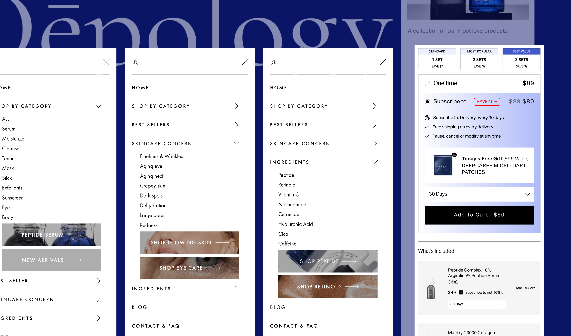
I redesigned the navigation around intent: product categories, skin concerns, ingredients, bestsellers, bundles, offers, and trust information. This turned the menu from a flat list into a decision aid.
From a business perspective, the goal was to protect paid acquisition efficiency. If users could find a relevant product route faster, Depology could scale traffic with less leakage before the product page.
2 — Rebuild the buybox as the main decision module
The buybox had to carry too many decisions without enough hierarchy: variant choice, subscription discount, one-time purchase, bundle value, free-gift logic, delivery cadence, price, and add-to-cart action.
I redesigned it as a reusable decision module. Offer hierarchy, selected states, disabled states, price visibility, incentive copy, and CTA priority were clarified so users could understand the recommended path without losing control.
From a business perspective, the buybox was the highest-leverage conversion surface. Making the offer easier to understand directly supported checkout conversion and reduced repeated redesign work for future product launches.
3 — Carry confidence into cart and checkout
After add-to-cart, the same confidence problem continued. Users needed to see what they had selected, what incentive applied, what would happen next, and how to recover from mistakes without restarting the journey.
I clarified cart summary, quantity control, upsell entry, discount field, delivery form, order total, loading states, error states, and sticky CTA behaviour. The point was not to push harder. It was to remove avoidable doubt.
From a business perspective, this helped reduce abandonment at the point where acquisition cost had already been spent and user intent was highest.
4 — Turn repeated fixes into a reusable commerce system
The work was not only a page redesign. Navigation, buybox, product-grid, sticky CTA, cart, checkout, and offer states became reusable patterns that could support future launches.
I documented responsive behaviour, content order, state rules, implementation priorities, and QA notes for developers. The system had to preserve purchase hierarchy at both 1440px desktop and 375px mobile, not just look consistent in Figma.
From a business perspective, this reduced the cost of launching and testing new products. The team no longer had to solve the same commerce decisions from scratch each time.
Delivery and results
In the rollout, the new patterns were applied across navigation, product-page decision areas, cart, and checkout. The design system also created clearer handoff rules for future product launches and campaign tests.
The redesigned funnel doubled checkout conversion across two rollout cycles, reduced cart abandonment by 50%, cut design-to-build time by 30%, and helped reduce testing cycles from two weeks to 4 days.
So what?
The project showed that conversion problems are often system problems. Users were not dropping because one screen looked wrong; they were losing confidence across a chain of small decisions.
By turning those repeated moments into shared patterns, Depology improved conversion and delivery speed at the same time. The useful lesson is simple: a design system is strongest when it captures validated product decisions, not just visual consistency.